
EVIE Bikes
Sept 22′ – May 24′
Overview
Step into the world of EVIE Bikes pioneering e-bike technology, where innovation meets user-centric design. Explore our collaborative effort to craft a mobile application that seamlessly connects riders with their bikes, redefining the way they experience urban mobility.
Role
Product Designer
UI flow design, Prototyping, User testing, Illustration, & Animation
Tools
Figma, Adobe Illustrator, After Effects
Background
Being part of the EVIE Bikes team, we aimed to revolutionize the e-bike market by enhancing the rider experience through advanced digital solutions and simple, user-centered design. Our work was guided by a mutual dedication to sustainability and cutting-edge technology.
Understanding the Problem
Our collective challenge was to develop a mobile app that harmonizes with EVIE Bikes e-bikes, empowering riders with intuitive control and unparalleled convenience. Together, we aimed to create a seamless interface that fosters a sense of community among riders while enhancing their connection to the e-bike ecosystem.
Persona

Brandon
Meet Brandon, the epitome of modern urban mobility. As a seasoned commuter navigating bustling city streets, Alex embodies the spirit of efficiency and sustainability. With a keen eye for seamless integration of technology into daily routines, Alex seeks innovative solutions to simplify the urban commute.
Goals:
- Simplify daily commuting with efficient transportation solutions.
- Stay connected and informed about bike status and performance.
- Enhance overall riding experience through intuitive technology.
Needs:
- Seamless integration between bike and mobile device.
- Access to real-time bike metrics and diagnostics.
- Intuitive controls for personalized riding preferences.
Defining the MVP
As a unified team, we identified the Minimum Viable Product (MVP) for the EVIE Bikes app to deliver immediate value to riders:
Must have:
- Dashboard: Display real-time bike metrics, including bike status, location, battery status, and distance traveled.
- Bike Connectivity: Seamlessly pair e-bike with mobile device via Bluetooth.
- Remote Control: Enable basic functionalities such as lock/unlock, motion sensitivity directly from the app.
- Notifications: Provide instant alerts for bike security status, system updates and other notifications.
Nice to have:
- Bike Naming: Allow users to personalize their e-bikes by assigning custom names, fostering a sense of ownership and individuality.
- Bike Sharing: Implement features for bike sharing, facilitating community engagement and expanding accessibility to e-bike resources.
- Carbon Footprint: Integrate features to track and visualize carbon footprint reduction achieved through e-bike usage, promoting sustainability awareness among riders.
Not necessary:
- Weather Updates: While weather updates could enhance ride planning, they are deemed non-essential for the initial MVP release, prioritizing core functionalities for seamless user experience.
The Initial Design
User Registration
Our user registration was designed with efficiency in mind. Users could swiftly proceed by tapping a button to email inbox automatically. This approach removed unnecessary steps, creating a streamlined experience.
Bike Registration
The bike registration utilized a guided process where each step was focused on a single task. Whether enabling location services or setting up notifications, users only needed to click once to grant access, ensuring the process was clear and user-friendly.
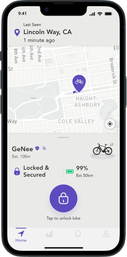
Dashboard Design
We designed the dashboard to be highly functional, providing a full view of bike details on a single screen. The unlock bike button was strategically placed for easy access, and icons were used to simplify the interface, balancing clarity with comprehensive information.
Gathering Insights
We conducted 10 user interviews to dive deep into the user experience. Participants were asked to complete essential tasks like account registration, bike setup, dashboard interpretation and etc. They also rated their emotions for each task given, providing insight into the overall user experience.
Main Goals of the Testing
The testing was designed to:
- Identify User Pain Points: Discover areas where users faced confusion or frustration.
- Measure Task Efficiency: Evaluate how easily users could complete each task.
- Capture Emotional Insights: Understand user emotions to pinpoint areas needing improvement.
- Refine Design: Utilize feedback to enhance the design and improve the user experience.
The Turning Point
The usability testing marked a pivotal moment in our design process, revealing both strengths and areas for improvement.

Good Feedback
- User Registration: Users found the process quick and simple, particularly with Apple ID, noting it as easy and fast.
- Bike Registration: The process was praised for being interactive and very fast, with users appreciating the ease of setting up permissions with a simple tap.
Bad Feedback
- User Registration: Issues were noted with email registration, including bugs and uncertainty about whether enough information was provided.
- Bike Registration: Users were confused by the loading times and had difficulties confirming if the bike was successfully connected. Manual key entry also led to frustration due to the inability to go back or cancel.
- Dashboard Interpretation: Significant challenges were reported, such as unclear icons, poor information grouping, and a lack of clarity on the dashboard, with many users struggling to interpret the displayed data.
Refining the User Experience
In response to the feedback, we initiated a collaborative effort with our software and hardware teams to identify and address the core issues. This collaboration fueled a redesign of the UI, resulting in a more personalized, efficient, and user-friendly experience. Key updates include proximity-triggered features, improved flow, better information organization, and easier access to critical tools.
From Complexity to Clarity
The redesign focused on simplifying the user experience, making key actions more intuitive and personalized, while reducing unnecessary complexity.
Seamless Sign-Up
Engage users with a seamless sign-up process offering multiple methods, including email sign-up, Facebook and Google sign-up flow designed for ease. Personalize the experience by asking for the user’s name, fostering engagement, and offering direct access to their email inbox upon entering email address for verification.
Effortless Bike Registration
Registering a new EVIE bike is made easy with options to scan the QR code or manually input details. Additionally, users are encouraged to personalize their bike by naming it during the registration process, fostering a sense of ownership and connection.
First-Time Greeting
The welcome page is thoughtfully crafted to make the first ride seamless, guiding users to enable Bluetooth and connect with their bike instantly. This intuitive setup ensures a smooth and enjoyable experience right from the outset, setting a positive tone for their journey with the e-bike.
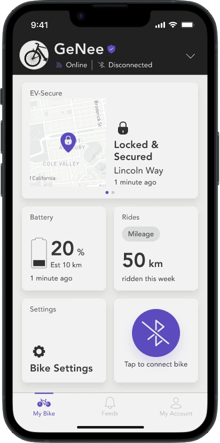
Organized Dashboard
The homepage features intuitive card-based sections, each thoughtfully arranged to provide easy access to essential information. Whether checking battery status or exploring ride history, every interaction feels natural and welcoming, ensuring users feel confident and connected to their e-bike.